Right after I publsihed my article on rebranding the Syracuse Crunch, I had a though. "Why not rank all the logos in the American Hockey League for the upcoming 2015-16 season?" So, I did. Here is my rankings.
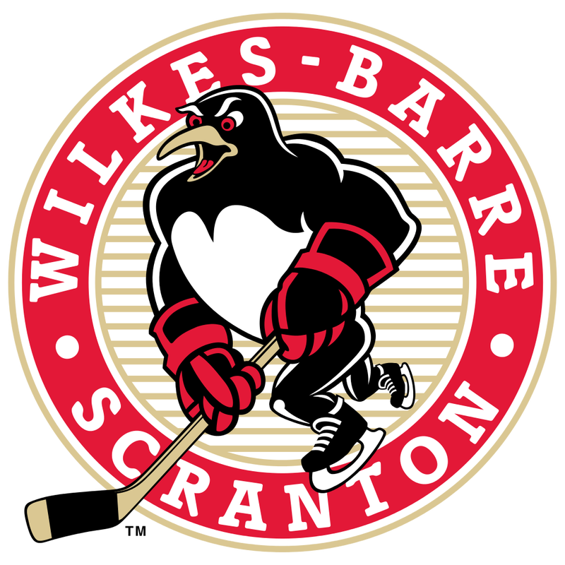
1.) Wilkes-Barre Scranton Penguins- The Baby Pens Penguin logo is better than the Pittsburgh Penguin's logo. Unlike the cartoonish one the parent club has, Scranton's penguin looks buff and intimidating. Maybe the affiliate and parent club should trade logos.
2.) Milwaukee Admirals- The pirate skeleton with the black and blue color scheme is just brilliant. They even incorporated the skeleton theme throughout the entire jersey. Very creative.
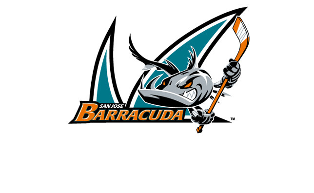
3.) San Jose Barracuda- New city and a new image for the Sharks affiliate. If a Shark isn't scary enough, a barracuda should make your knees shake. The logo is even scary.
4.) Bakersfield Condors- When I envision a condor, I imagine a huge bird circling its prey in a desert climate. With a bright orange color scheme, this team will be looking to hunt down its prey on the ice.
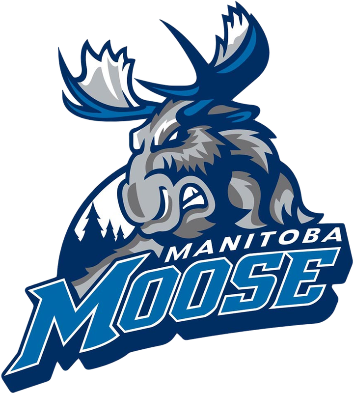
5.) Manitoba Moose- Thank the hockey gods that the Moose are back! WIth a new blue color scheme from the Winnipeg Jets, they look better than ever!
6.) Rochester Americans- Simple, classic, and patriotic. Enough said.
7.) Hershey Bears- One of the original AHL franchises, the team finally nailed a great logo with a roaring brown bear. They also have kept the chocolate color scheme that matches the city. Smart.
8.) Hartford Wolf Pack- When the team was rebranded as the Connecticut Whale, I was disappointed. Thankfully, clearer minds prevailed and the Wolf Pack returned. A howling wolf is great with the red, blue, and white color scheme. The wolf headed submarine shoulder patch is also cool.
9.) San Diego Gulls- A reboot, this clean seagull logo is pretty cool. Perfect for the beautiful Pacific Coast city.
10.) Utica Comets- A reboot of the legendary Clinton Comets, the Vancouver Canucks color scheme works well with the logo and jerseys.
11.) Grand Rapids Griffins- A griffin is a hybrid between a lion and an eagle, two very powerful animals. Matches the success that team has had over the last few years (even at the expense of the Crunch.)
12.) San Antonio Rampage- A stampede of bulls and cattle is very frightening. For a hockey team in Texas, Rampage is the perfect branding. The blue, black, and silver is a nice touch too.
13.) St. Johns Ice Caps- Being the most northern team in the league, the Ice Caps name is very fitting. The new red and blue color scheme with the Canadians affiliation isn't bad either.
14.) Chicago Wolves- A scary looking wolf is always a great logo. I still don't get why they aren't with the Blackhawks. They are in the same city, it would work out quite well.
15.) Stockton Heat- The Heat name works well with the Flames affiliation. The logo is quite sharp too.
16.) Rockford Ice Hogs- Wild pigs are known to be beastly. However, this logo reminds me of bacon. Mmm...bacon.
17.) Springfield Falcons- A falcon is a majestic and terrifying bird of prey. This team is usually the same. The logo illustrates it well.
18.) Charlotte Checkers- No idea how a polar bear relates to Charlotte, but the logo is still sharp.
19.) Binghamton Senators- The name is a copy of the parent club, but the senator logo is still tough looking. I'll give them that.
20.) Portland Pirates- The logo is a typical vision of a pirate, but it works for the team. Better than their original logo.
21.) Lake Erie Monsters- When I see their logo, the jaws theme goes through my head. It's creative with the whole lake monster idea, but the logo needs more.
22.) Bridgeport Sound Tigers- I like the color scheme but the Tiger logo is not great. I have to do a double take sometimes to make sure it is a head of a tiger.
23.) Syracuse Crunch- See my previous article.
24.) Toronto Marlies- Their logo is a more detailed leaf compared to their parent club. Not very exciting honestly and lacking creativity.
25.) Albany Devils- A devil themed letter A isn't great. Then again, their parent club's logo isn't that creative either. I miss the River Rats.
26.) Leigh Valley Phantoms- A pair of evil looking eyes has lost it's touch. They should consider the older shoulder patch logo from the days of the Philly Phantoms.
27.) Iowa Wild- The logo is the weird style text or the Minnesota logo is a circle. Originally isn't there on this one.
28.) Texas Stars- It's the same as the old Dallas Stars' logo. With the green and gold color scheme, bland is what I'm left thinking.
29.) Ontario Reign- It's the old LA Kings logo. Unoriginal. They should have kept their ECHL logo and color scheme. That was stellar.
30.) Providence Bruins- It's the Bruins logo just with a P. Anything but original.
What do you think? Do you agree or do you have different thoughts? Comment below!
Thanks/Credits:
theahl.com
http://upload.wikimedia.org/wikipedia/en/0/00/ManitobaMoose.png
http://upload.wikimedia.org/wikipedia/en/thumb/5/5b/Wilkes-Barre_-_Scranton_Penguins.svg/1024px-Wilkes-Barre_-_Scranton_Penguins.svg.png
http://upload.wikimedia.org/wikipedia/en/thumb/7/76/Milwaukee_Admirals.svg/1024px-Milwaukee_Admirals.svg.png
http://2.cdn.nhle.com/sharks/images/upload/2015/04/20150402-sj-barracuda-dl.jpg
https://pbs.twimg.com/profile_images/587329575715115008/oxrGDSBx.jpg
Below: The Top Five Logos
1.) Wilkes-Barre Scranton Penguins- The Baby Pens Penguin logo is better than the Pittsburgh Penguin's logo. Unlike the cartoonish one the parent club has, Scranton's penguin looks buff and intimidating. Maybe the affiliate and parent club should trade logos.
2.) Milwaukee Admirals- The pirate skeleton with the black and blue color scheme is just brilliant. They even incorporated the skeleton theme throughout the entire jersey. Very creative.
3.) San Jose Barracuda- New city and a new image for the Sharks affiliate. If a Shark isn't scary enough, a barracuda should make your knees shake. The logo is even scary.
4.) Bakersfield Condors- When I envision a condor, I imagine a huge bird circling its prey in a desert climate. With a bright orange color scheme, this team will be looking to hunt down its prey on the ice.
5.) Manitoba Moose- Thank the hockey gods that the Moose are back! WIth a new blue color scheme from the Winnipeg Jets, they look better than ever!
6.) Rochester Americans- Simple, classic, and patriotic. Enough said.
7.) Hershey Bears- One of the original AHL franchises, the team finally nailed a great logo with a roaring brown bear. They also have kept the chocolate color scheme that matches the city. Smart.
8.) Hartford Wolf Pack- When the team was rebranded as the Connecticut Whale, I was disappointed. Thankfully, clearer minds prevailed and the Wolf Pack returned. A howling wolf is great with the red, blue, and white color scheme. The wolf headed submarine shoulder patch is also cool.
9.) San Diego Gulls- A reboot, this clean seagull logo is pretty cool. Perfect for the beautiful Pacific Coast city.
10.) Utica Comets- A reboot of the legendary Clinton Comets, the Vancouver Canucks color scheme works well with the logo and jerseys.
11.) Grand Rapids Griffins- A griffin is a hybrid between a lion and an eagle, two very powerful animals. Matches the success that team has had over the last few years (even at the expense of the Crunch.)
12.) San Antonio Rampage- A stampede of bulls and cattle is very frightening. For a hockey team in Texas, Rampage is the perfect branding. The blue, black, and silver is a nice touch too.
13.) St. Johns Ice Caps- Being the most northern team in the league, the Ice Caps name is very fitting. The new red and blue color scheme with the Canadians affiliation isn't bad either.
14.) Chicago Wolves- A scary looking wolf is always a great logo. I still don't get why they aren't with the Blackhawks. They are in the same city, it would work out quite well.
15.) Stockton Heat- The Heat name works well with the Flames affiliation. The logo is quite sharp too.
16.) Rockford Ice Hogs- Wild pigs are known to be beastly. However, this logo reminds me of bacon. Mmm...bacon.
17.) Springfield Falcons- A falcon is a majestic and terrifying bird of prey. This team is usually the same. The logo illustrates it well.
18.) Charlotte Checkers- No idea how a polar bear relates to Charlotte, but the logo is still sharp.
19.) Binghamton Senators- The name is a copy of the parent club, but the senator logo is still tough looking. I'll give them that.
20.) Portland Pirates- The logo is a typical vision of a pirate, but it works for the team. Better than their original logo.
21.) Lake Erie Monsters- When I see their logo, the jaws theme goes through my head. It's creative with the whole lake monster idea, but the logo needs more.
22.) Bridgeport Sound Tigers- I like the color scheme but the Tiger logo is not great. I have to do a double take sometimes to make sure it is a head of a tiger.
23.) Syracuse Crunch- See my previous article.
24.) Toronto Marlies- Their logo is a more detailed leaf compared to their parent club. Not very exciting honestly and lacking creativity.
25.) Albany Devils- A devil themed letter A isn't great. Then again, their parent club's logo isn't that creative either. I miss the River Rats.
26.) Leigh Valley Phantoms- A pair of evil looking eyes has lost it's touch. They should consider the older shoulder patch logo from the days of the Philly Phantoms.
27.) Iowa Wild- The logo is the weird style text or the Minnesota logo is a circle. Originally isn't there on this one.
28.) Texas Stars- It's the same as the old Dallas Stars' logo. With the green and gold color scheme, bland is what I'm left thinking.
29.) Ontario Reign- It's the old LA Kings logo. Unoriginal. They should have kept their ECHL logo and color scheme. That was stellar.
30.) Providence Bruins- It's the Bruins logo just with a P. Anything but original.
What do you think? Do you agree or do you have different thoughts? Comment below!
Thanks/Credits:
theahl.com
http://upload.wikimedia.org/wikipedia/en/0/00/ManitobaMoose.png
http://upload.wikimedia.org/wikipedia/en/thumb/5/5b/Wilkes-Barre_-_Scranton_Penguins.svg/1024px-Wilkes-Barre_-_Scranton_Penguins.svg.png
http://upload.wikimedia.org/wikipedia/en/thumb/7/76/Milwaukee_Admirals.svg/1024px-Milwaukee_Admirals.svg.png
http://2.cdn.nhle.com/sharks/images/upload/2015/04/20150402-sj-barracuda-dl.jpg
https://pbs.twimg.com/profile_images/587329575715115008/oxrGDSBx.jpg
Below: The Top Five Logos


 RSS Feed
