At the church my family attends, there is always a time where members of the congregation can bring up joys and concerns revolving around their own lives or the lives of others. If it was the Syracuse Crunch, it would be mostly joys. Right now, the Crunch are installing their new regulation rink, they just were announced as the hosts of the 2016 All Star Game, and more than a dozen Crunch alumni are set to compete in the Stanley Cup finals as members of the Tampa Bay Lightning. All wonderful news! However, with joy has to come concern. Has anyone noticed some displeasure with the Crunch's image? I mean, let's face some facts, our logo and branding is something to be desired. You're probably asking "What proof do I have?"
To start, our current Crunchman is anything but popular. In fact, when this season's Mascot Madness was held, he finished at the very bottom, failing to gain 100 votes. Ouch. Not only that, with every game I attended since the Crunch affiliated with Tampa Bay, I would hear at least one person bring up dissatisfaction with the Crunch's logo. If you total them up, it would land between 100 and 200 people. Not good at all.
So, why is the branding and logo so bad? Below is the Crunch's logos and their affiliates since 1994.
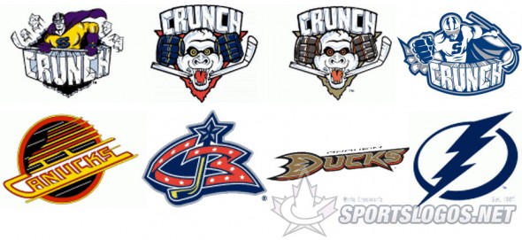
The Crunch's current logo is not the worst but not the best. The best thing about all of them is that the "Crunch" text has remained the same since the beginning, very clean and relevant to ice hockey. But the Crunchman of now to the Crunchman of then is lacking. I know our colors match the Lightning, believe me, there is nothing wrong with blue, grey, and white. However, it doesn't make our logo pop like the original Crunchman. I have to say that the purple, aqua, black, and yellow was and remains sharp and eye catching. Also, note how the current logo tries to have this three dimensional effect with the Crunchman leaning in with a punch. It doesn't work well. If anything, they should have reverted to the old style of Crunchman and done something more two dimensional and flat. I'll give them credit for trying, but it didn't come to complete perfection. The curved stick is also kinda weird, very noodle like. The good news is it's no where as confusing and bad as the Ice Gorilla concept. I mean, what does an Ice Gorilla have to do with Syracuse? They aren't even real? Nor is a hockey superhero, but at least it's more creative.
With the logo comes the mascot. Now, like I stated before, Crunchman was horrendous in this season's Mascot Madness. Honestly, he doesn't resemble a good mascot to me. He has a body tight suit with fake bulgy muscles, a blue cape, and a really creepy face mask. Most mascots are big characters who look funny and are easy to hug. Some examples, Audie from the Comets, Tux from the Penguins (who won Mascot Madness,) Moose from the Amerks, and Sonar from the Wolfpack. The old Crunchman was very fun and actually resembled a mascot. Then, there was Al the Ice Gorilla. The first Al scared everyone, no joke. The second Al was less scary but was not well kept. Obvious fact of life, white shows dirt. Thus, Al got dirty and smelly fast. Current Crunchman shows a lot of dirt too. Not good. In my opinion, Tully the Turtle is a better mascot than Crunchman.
So, what can be done about our logo and mascot situation? Is it time for change? There are a couple options. First, they can keep everything and keep being sub-par in the logo and mascot category. Another option would be keeping the Crunch name and changing the rest of the branding. The "Crunch" name is original and sounds cool. On the other hand, finding a object or animal (not an ice gorilla) is a difficult task, especially for Syracuse. Maybe a mean looking snowman. The other option is just do a complete overall and start from scratch. There a lot of options the Crunch can go for. We could be the Blizzard, the Storm, or Frost. Those names would go well with the Lightning affiliation, it's always a good idea to relate to the parent team. Other ideas could be the Mosquitos, the Swamp, or even the Miners (or Salt Miners.) It wouldn't be a bad option to turn back the clock and go with a past team name, such as the Hornets, Blazers, Eagles, or Stars. The final option would be going back to the original Crunch concept with the black, purple, aqua, and yellow colorway. Just some ideas.
What do you think? Is it time for a brand change? Or just a logo change? Comment below or contact me with your opinions!
Thanks/Credit:
theahl.com
http://news.sportslogos.net/wp-content/uploads/2012/07/crunch-logo-history2-590x271.jpg (For the Photo)
 RSS Feed
